Data Science


Kickstarter Projects

This project was completed as part of the UC Berkeley Data Analytics Bootcamp, to help teach us about Excel's capabilities for data analytics, with business analytics for Kickstarter projects being the focus at the time. A short analytical report of Kickstarter projects and which types of project subcategories tend to be successful is included in this repository here, with more information about the particulars of funding levels and individual projects available in the Excel spreadsheet here.


My code for this Kickstarter Analysis project is available here on Github.

Pymoli Analysis

This project was completed as part of the UC Berkeley Data Analytics Bootcamp, to help teach us about Pandas' capabilities for data analytics, with business analytics for a fictional "Heroes of Pymoli" online game providing the data for this project. The analysis for this project is located here and is derived from the Jupyter Notebook Heroes of Pymoli in the repo. Pandas is an incredibly useful package for organizing and cleaning data, and has a great file I/O functions for reading and writing CSVs and other data files.


My code for this Heroes of Pymoli analysis project is available here on Github.

Weather Analysis

This project was completed to solidify my understanding of API calls in python to gather data, as part of the UC Berkeley Data Analytics Bootcamp. There were two parts to this project - data collection using the Open Weather API to get current weather data for over 500 cities worldwide. The main purpose of this part of the project was to "prove" that the latitudes closer to the equator are warmer by sampling data uniformly across latitudes and longitudes around the world. The data actually shows that the tilt of the earth's axis for the Northern hemisphere's summer made temperatures peak at about 23 degrees latitude, as demonstrated here. There are strong linear fits across the southern and nothern hemispheres, with r-squared values of 0.84 and -0.72, with the fit likely improving if the data for each line were split by the 23-degree latitude instead of the equator. The WeatherPy notebook detailing these results more extensively is available here.


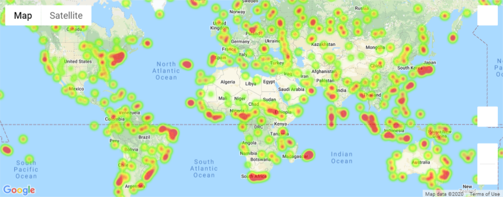
The second part of the project involved planning a vacation based on certain climate characteristics. These climate characteristics only matched a few cities around the world at the time of the notebook's creation, and could be adjusted depending on your preferences. The notebook finds hotels near the ideal climate coordinates using the Google Places API. This notebook also plots a heatmap showing the relative humidity levels across the globe - but note that these levels are not standardized to moisture content in the air which changes for different temperatures. The VacationPy notebook with the code for these results is available here.


My code for this project is available here on Github.

Climate Data App

This project used data from the above Weather Analysis project, which was integrated into this climate data app as part of the UC Berkeley Data Analytics Bootcamp. The project includes plots of temperature, cloudiness, humidity, and wind speed vs. latitude for the same cities around the globe as the WeatherPy project. Each plot has a brief description and analysis on its webpage. The data table for all cities is also available as part of this web application. The app uses GitHub Pages and Bootstrap to serve and style the content.


My code for this project is available here on Github.

Crypto ETL Project

This ETL project was planned and developed as as part of the UC Berkeley Data Analytics Bootcamp. The purpose of this project is to enable storage of 1-minute cryptocurrency price data in a SQL database on a computer, to allow comparisons between cryptocurrencies or further analysis of historical price data. This data is not readily available using APIs or Kaggle, since there is no large, centralized exchange of cryptocurrencies like there is for equities in the for of a stock exchange, like the NYSE or NASDAQ. This was especially true in the earlier years of cryptocurrencies, and the data here only goes back to about 2014 for Bitcoin and to about 2016 for Ethereum. The 2016 Ethereum date is close to the start of the modern Ethereum blockchain, so that is not as much an issue as Bitcoin, which dates back to 2009. Using the Coinbase Pro API, historical data for these cryptocurrencies was not available before around 2017, making this project worthwhile to use if planning long-term price analysis of the two major cryptocurrencies. The initial data sets were downloaded from Kaggle (see the readme for sources), and then patched to a contemporary date when the project was released using the Coinbase Pro "candles" API to retrieve historical 1-minute price data for both Bitcoin and Ethereum. The project uses a Jupyter Notebooks with Python and pandas to load the data into a SQL database containing two tables, one for Bitcoin and one for Ethereum, and uses a separate notebook to "patch" the data by retrieving up-to-the-minute prices (which may be delayed by about 10 minutes depending on the API results), which are then appended to the SQL tables for each cryptocurrency. These SQL tables could form the base for further price analysis or even enable intelligent trading algorithms that incorporate historical prices into their trading strategies.


My code for this project is available here on Github. Consult the readme if you want to try deploying the project on your own computer!

UFO Sightings Table

This UFO sightings "database" was planned and developed as as part of the UC Berkeley Data Analytics Bootcamp. The purpose of this project is to demonstrate the capabilities of JS frameworks like D3 for publicly serving data on websites, in this case as a filterable table. The data set was provided by the course, and a lot of the data is considered erroneous/hoaxes in the comments. New Year's Eve looked like a popular day for UFO sightings, especially in Southern California, but I did not analyze this small data set. If you want to get a more comprehensive dataset for UFO sightings, you can find one here on Kaggle, which includes more sightings and sightings in countries other than the US.


My code for this project is available here on Github. The readme outlines the project specifications and the possible search fields.

2014 ACS Scatterplot

This 2014 American Community Survey (ACS) data visualization was planned and developed as as part of the UC Berkeley Data Analytics Bootcamp. The purpose of this project is to demonstrate the capabilities of JS frameworks like D3 for publicly serving data on websites, in this case as a multi-axis scatterplot. The data set was available on the US census website here, along with lots of other demographic and socioeconomic data for the United States. This project used basic American Community Survey information about population obesity, smoking percentage, lack of healthcare, poverty, age, and household income by US state.


My code for this project is available here on Github.

USGS Past Week Earthquakes

This data dashboard project was planned and developed as as part of the UC Berkeley Data Analytics Bootcamp. This app is designed to help visualize all the earthquakes recorded worldwide. by the USGS in the past week. The past week's "all earthquakes" data is available as a JSON file through a link here. The magnitude of the earthquakes are represented by the size of the circle marker, and the depth of the earthquake is represented by the color of the circle marker. If you want more information about a particular earthquake event, just click the marker and more infomation will appear in a tooltip.


The app itself is located here and a video tutorial explaining how to use the application in detail is located here.


This project is a static webpage with no backend, so it was deployed as a Google bucket using the Google Cloud. Mapbox and Leaflet were used to build the custom map visualizations.


My code for this project is available here on Github.

VC Funding Project

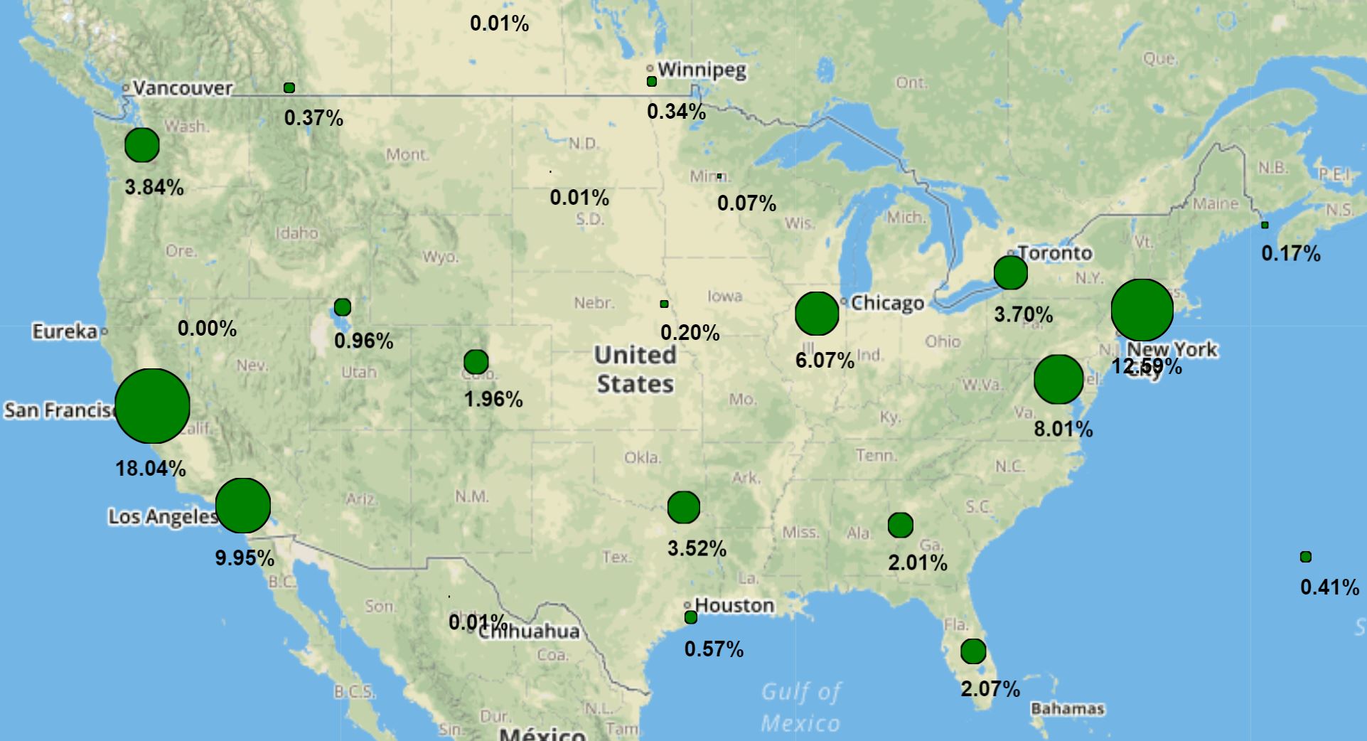
This Data Dashboard project was planned and developed as as part of the UC Berkeley Data Analytics Bootcamp. The purpose of this project is to enable quick, intuitive visualizations of 2005-2015 VC funding data for startups located in 3600+ cities throughout the world. The data was sourced from Kaggle.com and is available in a raw, uncleaned format here. The data was scraped from Crunchbase, a startup funding aggregator, and more recent data requires an Enterprise-level account with them that costs money and must be linked to a verified company.
This project was originally deployed on Heroku as a Flask app, using Python for the backend code, but was later modified to be served frontend-only, using Github Pages, because Heroku no longer supported a free-tier for hobby applications. The data was cleaned using pandas, and Google Maps Geocoding API provided the coordinates for each city containing startups. Mapbox and Leaflet were used to build the custom map visualizations, for both the cluster and choropleth maps. Chart.js provided the framework for the bar charts that show the funding levels for startups within different cities in the US and around the world.


My code for this project is available here on Github. There is a demo video available on Youtube explaining how to use the app and also giving some background on the creation of the app itself. Consult the readme if you want to try deploying the project as a Flask app on your own computer (using the original, source repo) or to get more information about the visualizations!

Tableau NYC Citi Bike Analysis

This Tableau workbook was planned and developed as as part of the UC Berkeley Data Analytics Bootcamp. The purpose of this workbook is to provide insight into different trends affecting the Citi bike ridership in New York City, potentially to advise city officials on how to improve the system. The data was sourced from the Citi Bike NYC System Data page and is available in a raw, uncleaned format here. There is too much data for the free, public version of Tableau to handle, so the project scope was reduced from examining three years (2017 to 2019) to find seasonal trends in ridership to examining only summer and winter in 2019, since that was the last calendar year unaffected by the coronavirus pandemic and resulting shutdown.


This workbook is deployed on my Tableau Public account here and includes six separate data visualizations, two data dashboards, one city map, and one story that describes the overall findings for each visualization and dashboard.


My code for this project is available here on Github. The readme also serves as a short report about the visualizations in the workbook, and the findings from the project.

TVS Loan Default Predictor

This machine learning project was planned and developed as as part of the UC Berkeley Data Analytics Bootcamp. The purpose of this project is to provide a feasibility study and prototype internal "app" that could be used to determine if a current auto loan customer presents a default risk at TVS. TVS is a motorcycle company in India, and the real-world data provided was used to train the models and includes vehicle loan, customer, and payment data. The data was sourced from Kaggle and is available here. As a general overview, we found that a gradient-boosted tree ensemble could accurately predict about 30-40% of all historical defaulters without eliminating too many valid loan customers given a theoretical cost function to estimate savings from preventing defaults. More information about our project development process and results are available as a PDF here.


The internal app prototype that could be used by a TVS loan officer to check if a customer should receive a personal loan offer given their demographics and vehicle loan payment history with TVS is available here - served by Heroku. The app may take up to 30 seconds to load due to server settings on Heroku, and information about default/non-default loan inputs are available at the bottom of one of the project's Jupyter notebooks (output cells 14 and 15) in case you wanted to try out the app! Please note that the currency is rupees since this is an Indian company.


My code for this project is available here on Github. Again, the project presentation details the ML methods and development process for this app, as well as the next steps to improve the project.

Marvel Bubble Chart

This data science application draws its data from a Kaggle dataset available here and was created to help me further develop and exhibit my programming, graph algorithms, data analysis, and data visualization skills, with interesting subject matter (Marvel superheroes) and a real-world application (finding the basis for selecting heroes for TV/movie/media franchises, which we find is highly related to first-degree connections from crossover comic books, and then predicting which superheroes will next appear in media franchises like the Marvel Cinematic Universe). If you look at the top 60 heroes by first-degree connection count, you can find just about all the current heroes that have had tv/movie appearances, and the ones missing when this project was started have good chances of appearing soon. In fact, some of the top heroes (like She-Hulk, Eros, the Black Knight, Hercules, Zeus, etc.) were not featured in the MCU when this analysis was initially conducted, but are now part of the MCU, validating the relationship between first-degree connections and likelihood of appearing in media. The Jupyter notebook for data exploration/analysis has more information, available here


My code for this project is available here on Github. There is also information about a sankey app in that repository, but that project was shutdown due to funding - I did not want to keep paying for AWS EC2 instances for this low-traffic, portfolio application.

UC Berkeley Data Analytics Bootcamp Interview

This interview was given regarding my upskilling experience with the UC Berkeley Data Analytics Bootcamp. The purpose of this interview is to help aspiring developers determine whether the bootcamp is right for them in their programming journey, as well as to showcase an example student's outcome and perspective - mine!


I personally had a great experience with this bootcamp, but I would highly advise anyone starting to learn programming to work through some other basic, cheaper, online courses first before attempting this bootcamp. The bootcamp is a large time commitment, with about 12 hours of class a week and weekly homework projects for six months, is expensive compared to other online options for learning data science and programming, and is not exactly beginner-friendly (about 1/3 of the class dropped out, which is probably a typical result). For example, there are a lot of free Udacity data science and programming classes that would be good to try before enrolling in this bootcamp, and understanding the basics of programming, Python, Javascript, HTML/CSS, and SQL should be prerequisites but are not! So I would recommend this bootcamp for beginner to intermediate software developers who already know something about programming and programming languages and have already taken some introductory classes in computer/data science and enjoyed working through those classes!

Kaggle

Kaggle is a website geared towards teaching data science through free online tutorials, shared notebooks and datasets, and competitions. I first heard about this resource through the UC Berkeley Data Analytics bootcamp, and much of the coursework for that bootcamp was drawn from publicly-available datasets on Kaggle. In addition to thousands of free, easily accessible datasets to analyze and create ML models for, there are also introductory classes that cover basic to advanced data science and ML concepts like data cleaning, feature engineering, game AIs, and neural networks, as well as basic programming skills in Python and pandas. You can check out these courses here.


In addition to free, interactive, online courses, you can also upload your own datasets to the website to share with others who might want to use your data. So far, I have shared two datasets - one for the cryptocurrency ETL project listed above, and one for a comprehensive Magic: The Gathering (MTG) card catalog available here. The MTG card catalog dataset has been more popular by far, so I would expect a lot of the Kaggle users to be younger/students who might not have as much use for cryptocurrency pricing data because they might not be working and have funds to invest.


The website also hosts online data science and ML competitions, which can be used as educational tools to learn new data science and ML techniques, or as a way to make some money because some of the competitions have cash or other rewards for top-ranked submissions. The competition is usually stiff for the cash competitions, and people with all levels of experience and backgrounds can compete, so I have not really participated in any non-educational competitions at this time. The competitions can have difficult datasets from real companies, and are sometimes sponsored by those companies to get working solutions to data science problems they are facing without having to hire full-time data scientists (as an "outsourcing" sort of solution). Sometimes these competitions can result in internship/job offers, but they are probably more competitive than the regular hiring channels. Also, the point differences between the top-ranked teams can often be slight, so there is also the issue of diminishing returns with some of the competitions if you are looking to win and make money vs. what a real-world solution would be.


Finally, if you want to see some examples of the introductory online course certificates they give you when you complete one of their courses, you can check out my Intro to AI Ethics certificate, Intro to Deep Learning certificate, and Intro to Game AI and Reinforcement Learning certificate! These certificates are not too hard to get since they only take ~4-8 hours of work each, but they sure are fun to look at!
Let's Connect